B Data Visualization
B.1 Barplots
- Using the
geom_barcreate a barplot for the frequencies of cars at different levels ofcarbfrom the datasetcarDt(useload()to load the dataset first)
load('HWdatasets/carDt.RDA')
ggplot(carDt, aes(x=carb)) + geom_bar() 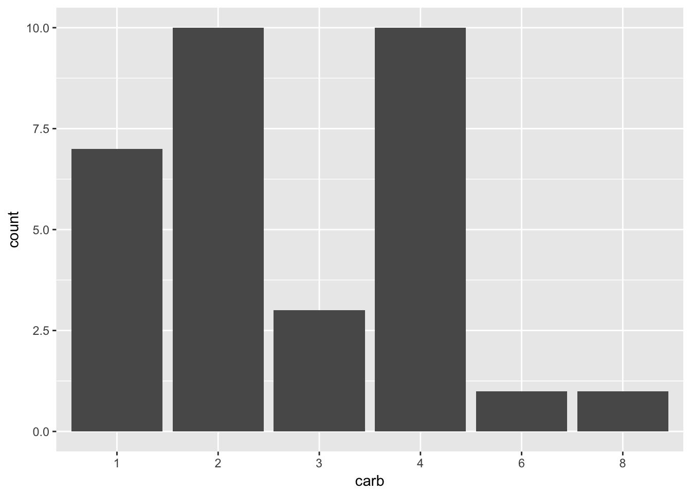
- Add to the barchart from question 1 a different fill color to each bar that maps to the variable
gear. Then:
- Add a title “Count of cars by each carb type”
- Add a subtitle “The count for each carb type is divided by number of gears”
ggplot(carDt, aes(x=carb, fill=gear)) + geom_bar() +
  ggtitle('Fist', 'Second')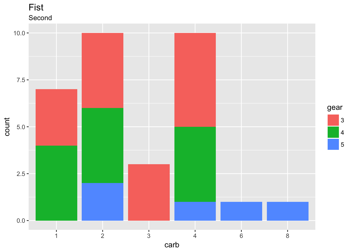
B.2 Line Chart
- Use the
beerDtdataset to plot a linechart of the alcohol consumption per capita by year.
- Add a title ‘Alcohol Consumption in US from 1850 to 2015’
- Add a subtitle ‘Quantity is expressed in gallons per capita’
- Change the color of the line to a color of your choice. Remember that non-data ink should not be declared within
aes() - Add a dot for each observation on the line using
geom_point
load('HWdatasets/beerDt.RDa')
ggplot(beerDt, aes(x = Year, y = GallonsCapita)) +
  ggtitle('Alcohol Consumption in US from 1850 to 2015', 'Quantity is expressed in gallons per capita') +
  geom_line(color = 'firebrick3') +
  geom_point() +
  theme_minimal()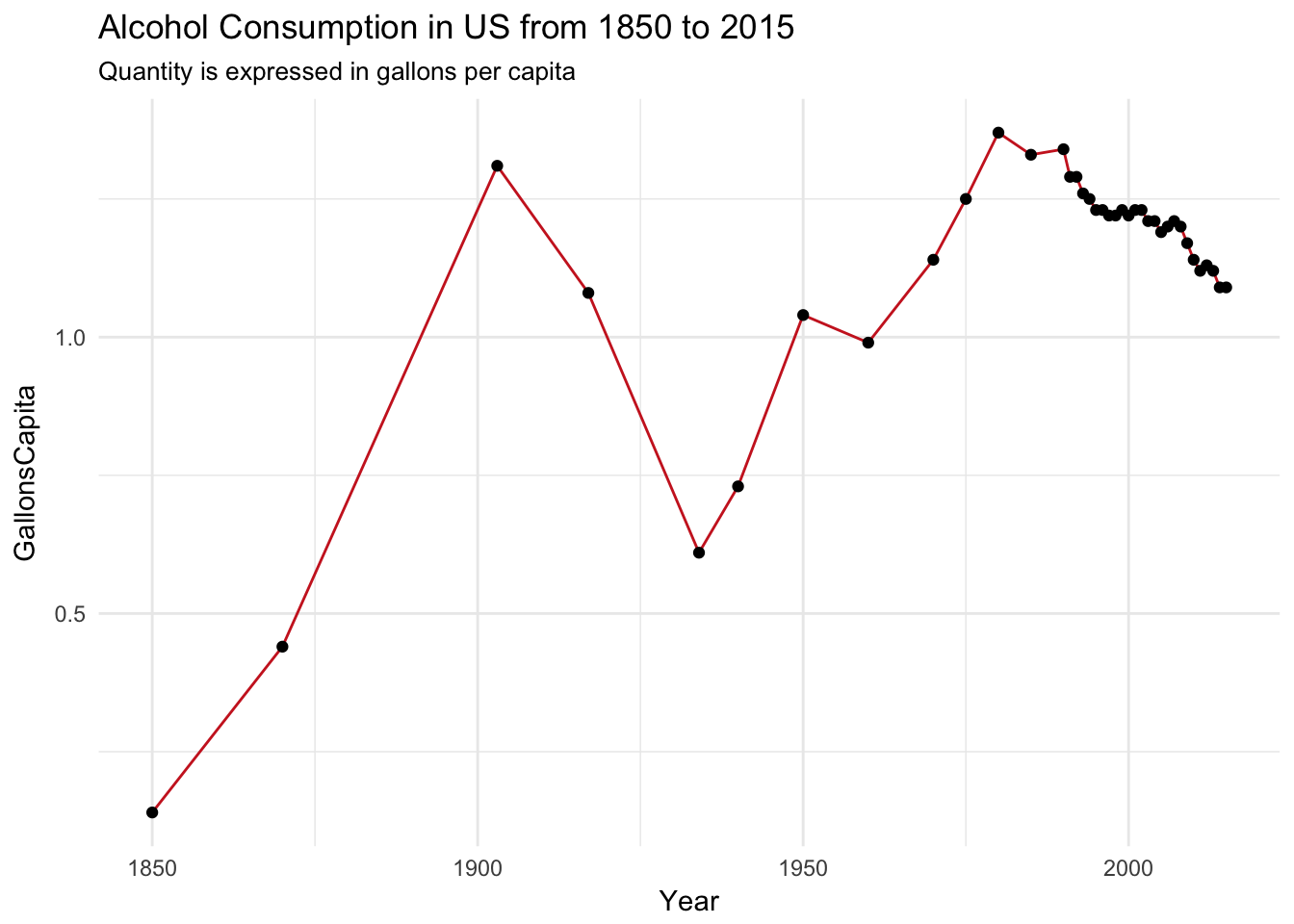
- Replicate the chart from 3 adding a
geom_line()for the GPD growth rate from the datasetgrowthDt. Remember that you are dealing with two different datasets,beerDtandgrowthDt, and that you cannot pass both of them in the sameggplot()call. You have two options:
- To pass one dataset to the
ggplot()call and the second to thegeom_line() - To leave
ggplot()empty and call one dataset in eachgeom_*.
load('dataset/growthDt.RDA')
ggplot(beerDt, aes(x=Year, y=GallonsCapita)) + geom_line() +
  geom_point() +
geom_line(data=growthDt, aes(x=Year, y=GrowthRate_s, color='red')) 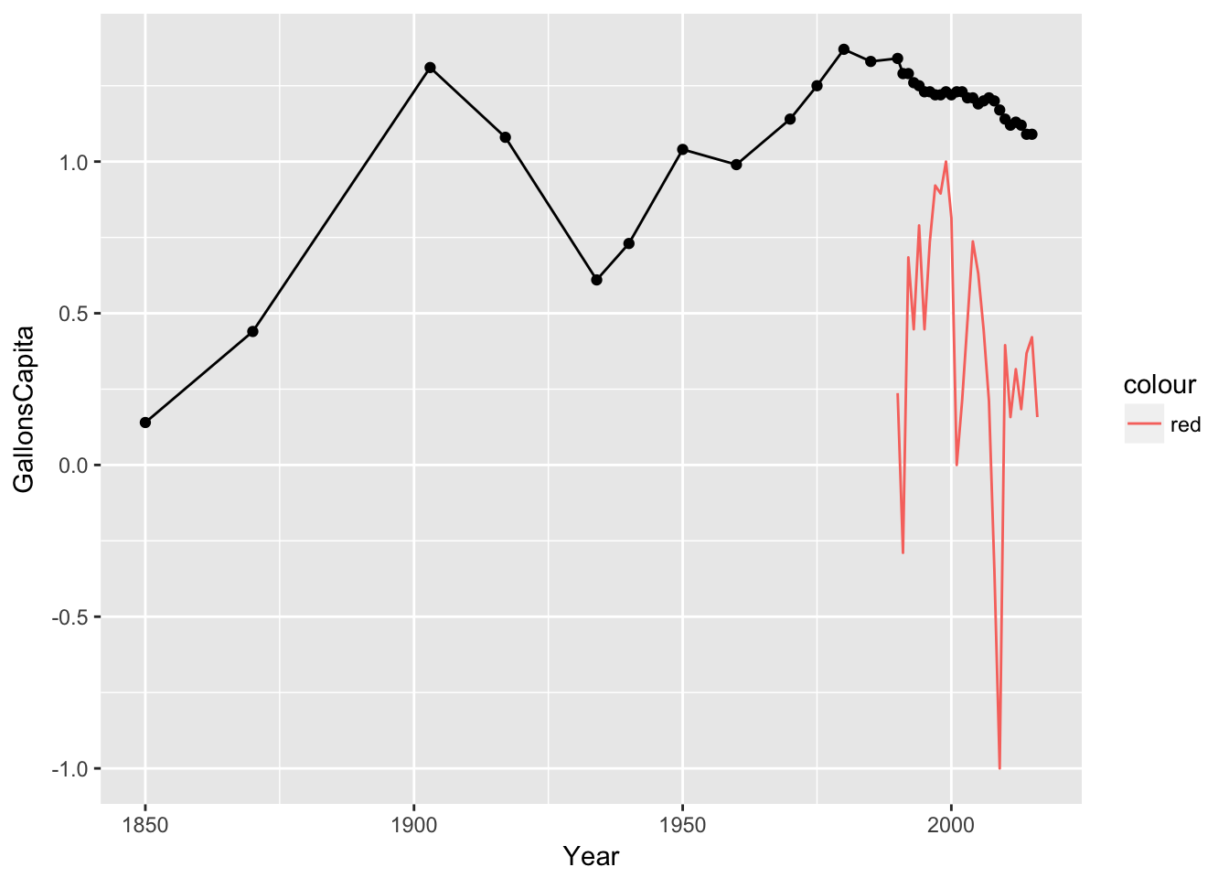
B.3 Faceting
- Use the dataset
titanicDtto create:
- A barchart of the survivors, where the
fillcolor maps the to survivors’ gender. Remember thatgeom_bar()will count by default, while in this dataset the columnncontains the count already. Change the attributestattostat="identity"(it is defaulted tostat='count') or usegeom_colinstead. - Use
facet_wrap()to creat a different barchart for each level of the variableClass - Add a complete theme of your choice (e.g.:
theme_minimal(),theme_classic()) - Add a title and a subtitle to the chart
load('HWdatasets/titanicDt.RDA')
ggplot(titanicDt, aes(x = Sex, y = n, fill = Survived)) +
  ggtitle('The Titanic shipwreck', 'Victims by class') +
  geom_bar(stat='identity') +
  facet_wrap(~Class) +
  theme_classic()