4 Data Visualization
Base R offers comes with native plotting functions for data visualization, such as plot(), barplot(), pie(), etc. which we do not cover in this training. Instead, we focus on another graphic library called ggplot2. Despite plotting functions in base R came chronologically before ggplot2 (and are still widely used), ggplot2 (cheatsheet) is probably the most popular package for dataviz. Its rapid success is due both to the attractive design of its plots and to a more consistent syntax. Also, there are a number of extensions developed within the ggplot2 framework that make easier to add themes or create more sophisticated charts.
4.1 ggplot2
ggplot2 builds on an underlying grammar, The Grammar of Graphics. Similarly to any grammar in natural languages, the Grammar of Graphics establishes a set of rules to build correct statements for building graphs. It entails seven fundamental elements:
| Element | Visual attribute |
|---|---|
| data | dataset with the variables of interst |
| aesthetics | x-axis, y-axis, color, fill, alpha |
| geometries | bars, dots, lines |
| facets | coloumns, rows |
| statistics | bins, smooth, count |
| coordinates | polar, cartesian |
| themes | non-data ink |
As any grammar in natural languages, statements that are grammatically correct are not necessarily meaningful. Similarly, a system that builds on the Grammar of Graphics does not necessarily prevent you from drawing misleading graphics.
To comply with the grammar, each ggplot2 statement requires at least a dataset, a set of aesthetics that the variables are mapped to, and the geometrical shape to visualize the aesthetics into. The concept of mapping is fundamental when learning ggplot2; although it might not be very intuitive at first, it ensures a high level of consistency when working in complex multivariate enviroment. To map means to assign a variable to an aesthetic, namely to a sensory attribute such as height, fill color, border color, etc. For instance, the code for 4.1 maps the variable class to the x-axis, then uses a geom_* function to indicate the physical object that the mapped values should be render into. The height of the bars (namely the value mapped to the y-axis) comes instead from the default behavior of geom_bar() which plots the count of the records with same class.
load('dataset/selfiesCasualties.RDA')
ggplot(data = selfiesCasualties, aes(x = class)) +
  geom_bar()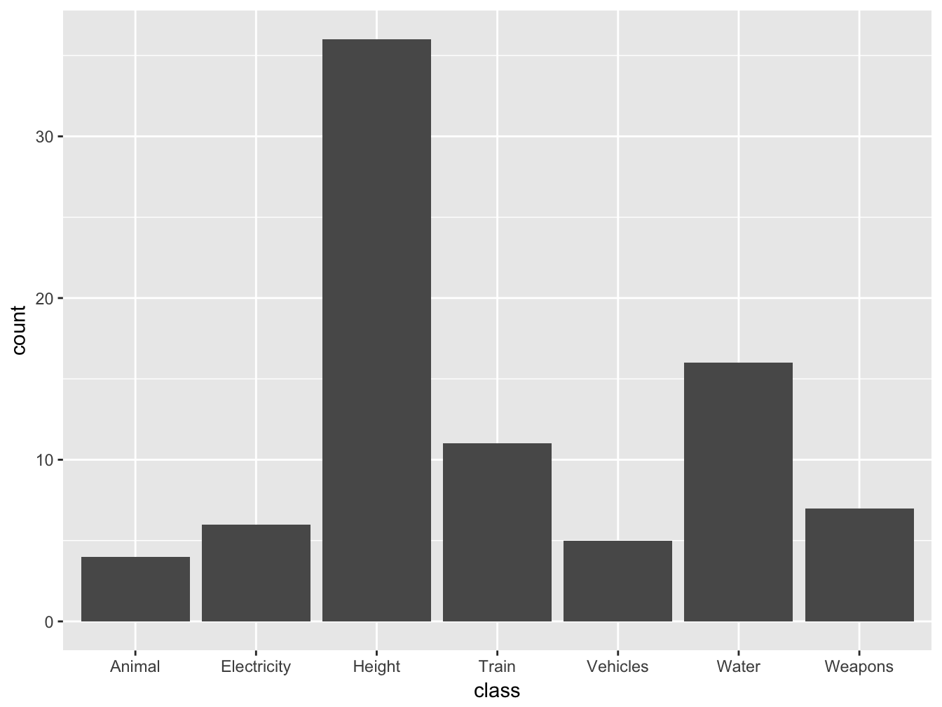
Figure 4.1: Casualties by class
To learn about all the aesthetics available for a certain geometry (such as geom_bar()), type ?geom_bar() and scroll down in the help pane to the paragraph Aesthetics:
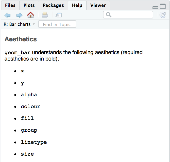
Figure 4.2: aesthetics of geom_bar
This means using geom_bar() you can map up to eigth variables to the same geometry. However, it does not imply that using all the aesthetics available is necessarily a good idea, in fact the chart might become quite hard to comprehend.
Figure 4.1 shows how geom_bar() plots frequencies for each level of the variable mapped to the x-axis. But does not the help pane (Figure 4.2) say that both x and y are required aesthetics? This works because behind the scene the default behavior of geom_bar is to count frequencies and map them to the y aesthetic. How do you know it? By looking at the documentation, which list all the attributes of geometries with their default values. The attribute of interest for this behavior in this case is geom_bar(..., stat="count"). Other times you might deal with datasets where frequencies are given, such as this:
| class | n |
|---|---|
| Animal | 4 |
| Electricity | 6 |
| Height | 36 |
| Train | 11 |
| Vehicles | 5 |
| Water | 16 |
| Weapons | 7 |
In this case you need to set the attribute stat = 'identity' to prevent geom_bar from counting frequencies and then pass the variable n to the aesthetic y, where n is the count of records for each level of class:
ggplot(data = freqCasualties, aes(x = class, y = n)) +
  geom_bar(stat='identity')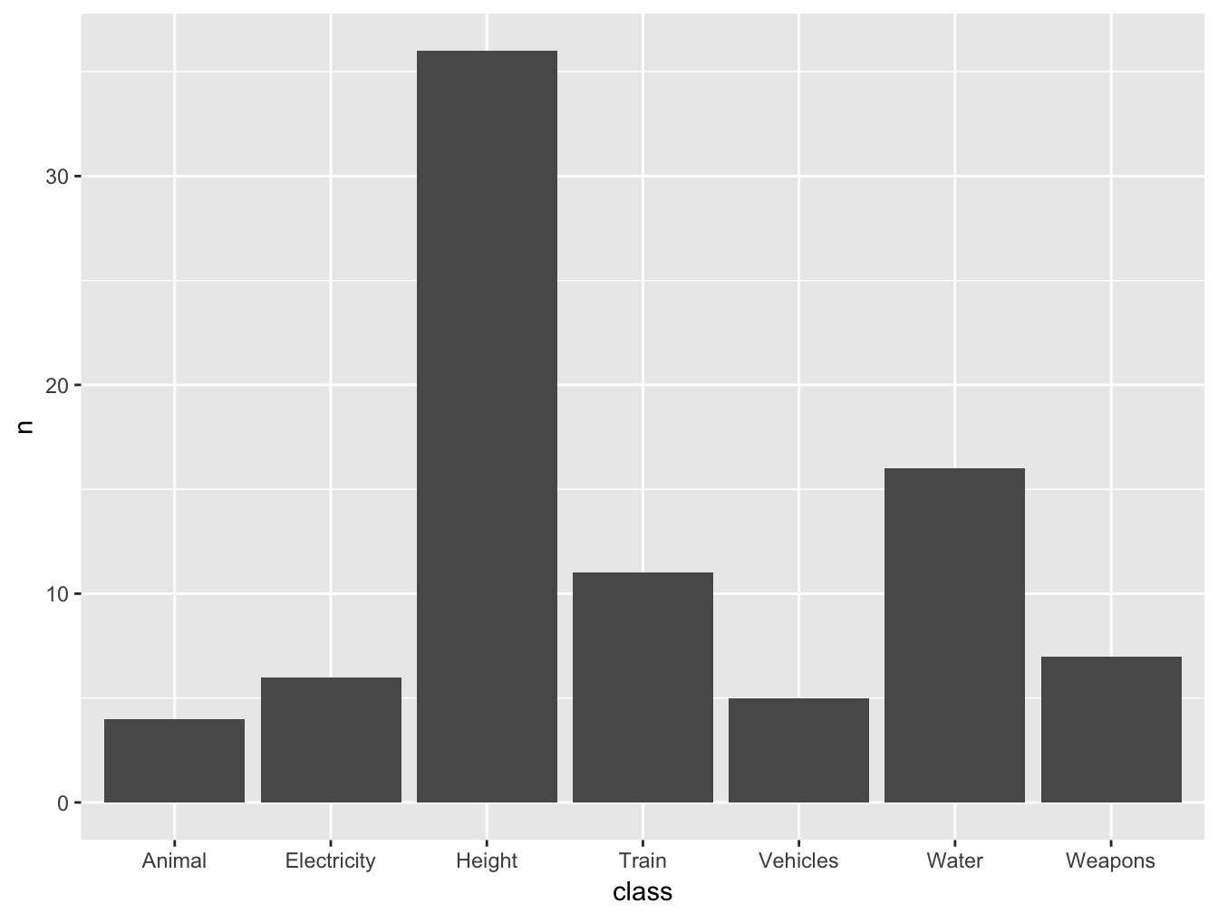
Figure 4.3: Casualties by class
As we saw earlier, ggplot allows to map several variable to different aesthetics of the same geometry. For example, in Figure ?? we map gender to the aesthetic fill:
ggplot(data = selfiesCasualties, aes(x = class, fill = gender)) +
  geom_bar()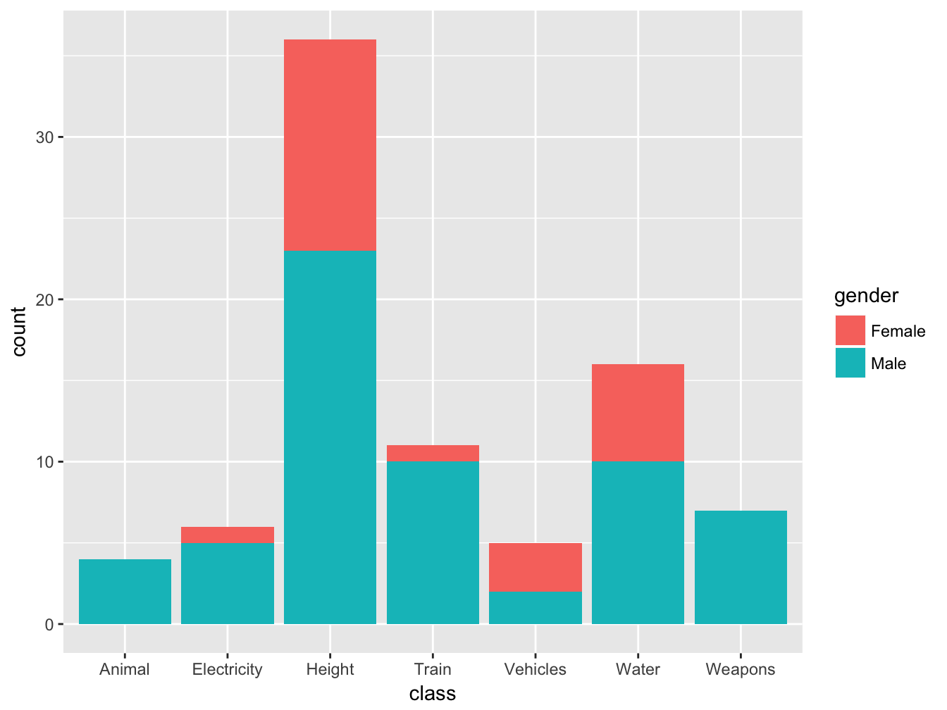
Finally, we can add some narrative to the chart using the ggtitle() to add a title and subtitle, and xlab() or ylab() to rename the axes:
ggplot(data = selfiesCasualties, aes(x = class, fill = gender)) +
  geom_bar() +
  ggtitle('A barplot of fatalities',
          subtitle = 'Selfies are not simply inappropriate, but even dangerous') +
  xlab('Cause of death') +
  ylab('count')
4.1.1 Line chart and dot plots
Apart from geom_bar ggplot2 includes more than 40 geomtries. We will not review them all, but it is worth mentioning two more geoms, namely geom_point and geom_line, typically used for dot plots and line charts. For instance, to draw a dotplot of the relationship between a car speed and its stopping distance from the built-in dataset cars:
ggplot(data = cars, aes(x = speed, y = dist))+
  geom_point()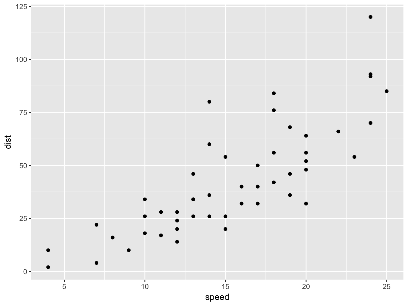
Using the exact same aesthetics but a different geom, we can turn the a dotplot into a linechart pretty easily:
ggplot(data = cars, aes(x = speed, y = dist)) +
geom_line()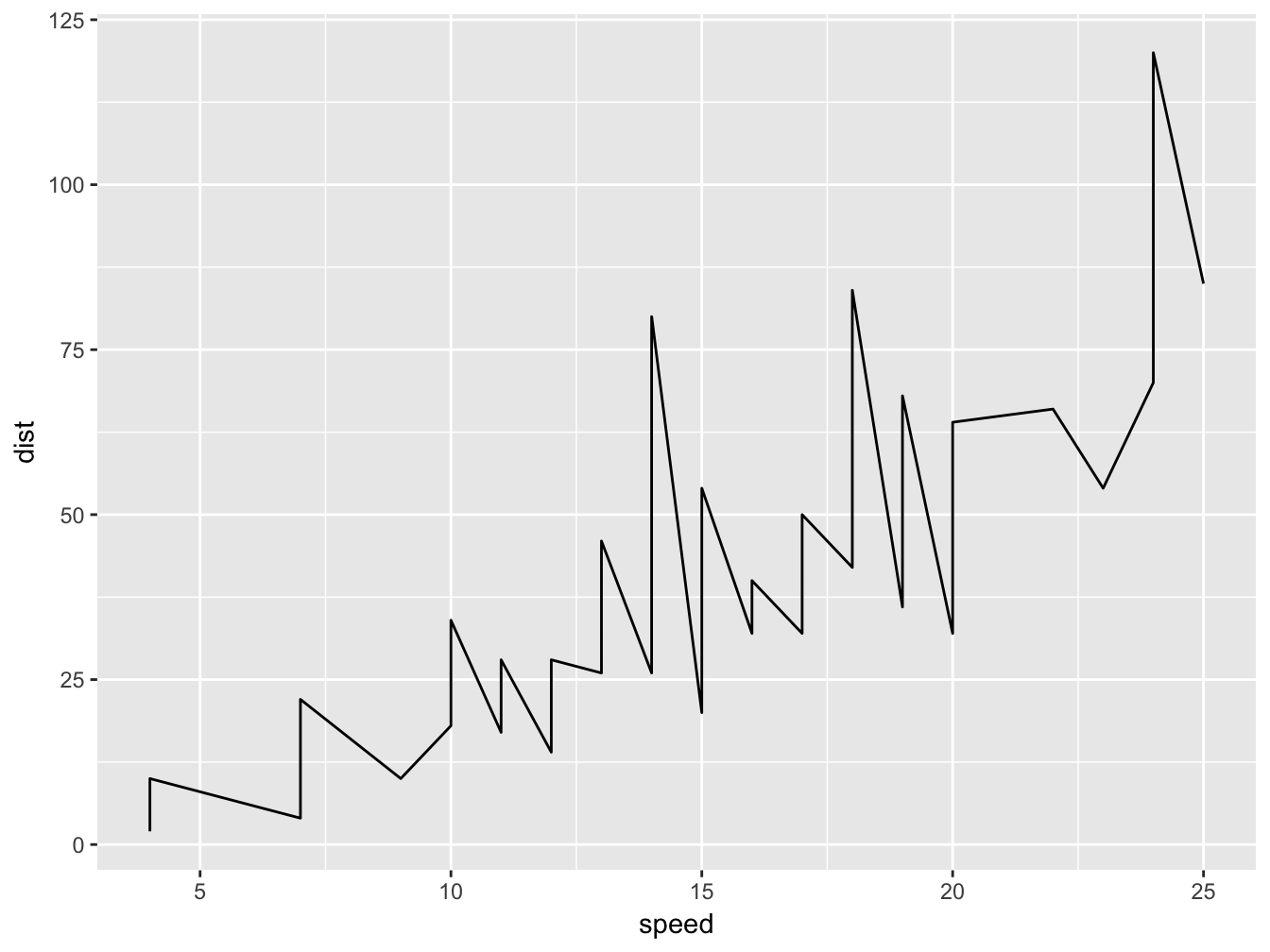
Note that every geom_ is a new layer superimposed onto the rendered area. This allows to combine multiple geoms onto the same chart simply by chaining them:
ggplot(data=cars, aes(x=speed, y=dist)) +
  geom_line(color='red') +
  geom_point(size=1) +
  geom_smooth()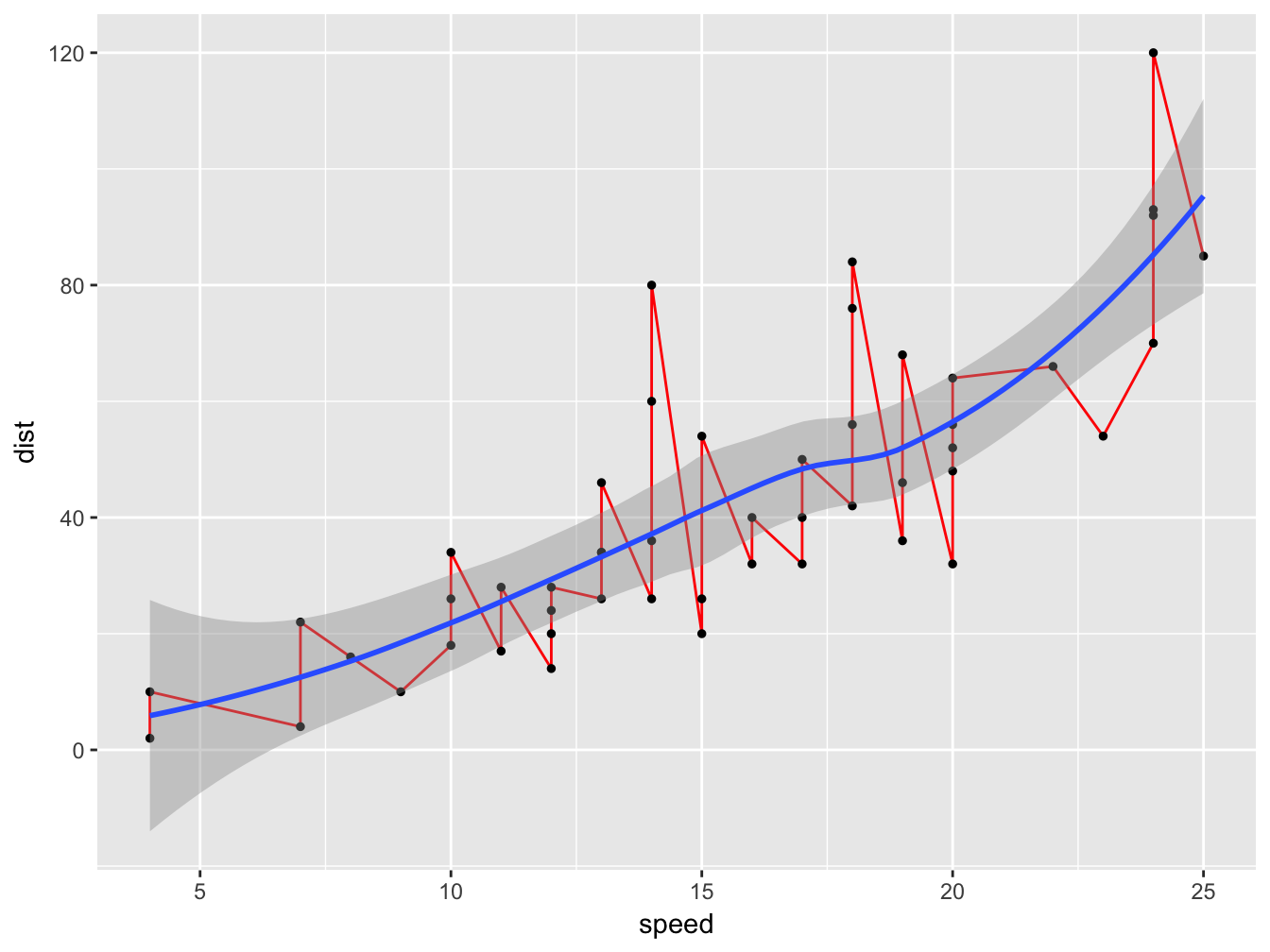
When specifying x and y in ggplot(), these aesthetics are inherited by every geom_. The same is true for the data (cars in this case), declared within the call to ggplot(). However, we could keep the aesthetics specific to a single geom as well; in fact we want to do this when using multiple geoms that do not understand certain aesthetics. For instance, by declaring color within geom_line() we prevent geom_point from inheriting color='red'. Note the difference when we set color='red' as an aesthetics of the all ggplot object (Figure @ref:fig(dotplotRedObject)) versus as an aesthetic of the geom (Figure @ref:fig(dotplotRedGeom)):
ggplot(data=cars, aes(x=speed, y=dist, color='red')) +
  geom_line() +
  geom_point(size=1) +
  geom_smooth()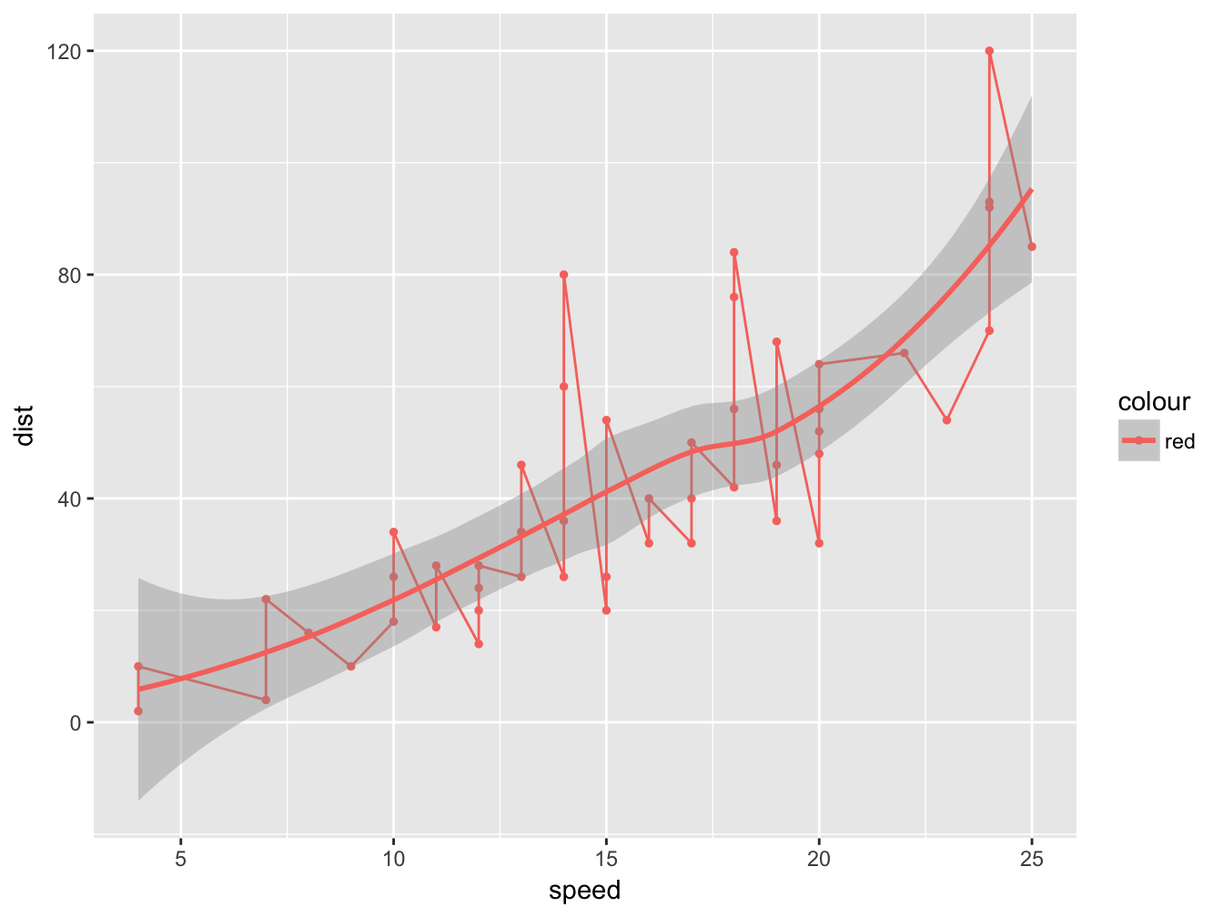
4.1.2 Facetting
In the previous paragraph we saw how to plot multivariate data to different aesthetics, even though interpreting charts with more than 3-4 variables might become rather challenging. A viable remedy to accomodate more (categorical) variables is to use facets. facet_grid() forms a matrix of panels dafined by row and clumn facetting variables (Figure @ref:fig(facetPlot1)). For example we can use facet_grid(), to split the relationship between mpg and disp among the two levels of am:
ggplot(data=mtcars, aes(x=mpg, y=disp)) +
  geom_point() +
  facet_grid(~am) +
  xlab('Mileage') +
  ylab('Engine displacement') +
  ggtitle('The relationship mileage and engine displament', 'Difference between automatic (1) and manual (0) transmission')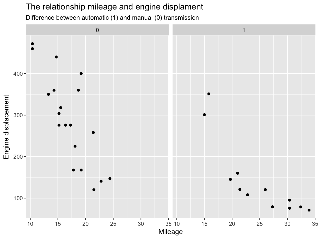
4.2 Tidy data
Plotting in ggplot2 requires that you use datasets complying with the concept of tidy data. The requisites for a tidy dataset (also called longitudinal or normal) are:
- Each variable forms a column.
- Each observation forms a row.
- Each type of observational unit forms a table.
So far all the datasets have been dealing with are tidy, but this will not be always the case. Untidy dataset are not necessarily “bad”, but they are unsuitable for plotting with ggplot2.
Possible violations of the requisites for a tidy dataset are:
- Multiple variables are stored in one column.
- Variables are stored in both rows and columns.
- Multiple types of observational units are stored in the same table.
- A single observational unit is stored in multiple tables.
| class | Female | Male |
|---|---|---|
| Animal | NA | 4 |
| Electricity | 1 | 5 |
| Height | 13 | 23 |
| Train | 1 | 10 |
| Vehicles | 3 | 2 |
| Water | 6 | 10 |
| Weapons | NA | 7 |
For instance, you might notice that in Table 4.2 Female and Male are split into two different columns even though they represent two levels of the same binary variable gender. To tide the dataset, we want (i) to collapse the counts for males and females into the same variable count, and (ii) to turn the headers female and male into levels of the variable gender. The tidy form of Table 4.2: looks in fact like Table 4.3:
| gender | class |
|---|---|
| Male | Electricity |
| Female | Height |
| Female | Vehicles |
| Male | Vehicles |
| Male | Train |
| Female | Height |
To learn how to use R to reshaping and tidying data, read 4.3.
4.3 Data Wrangling
When using ggplot we want our data to be in a tidy form form, but this is not always the case. Sometimes we might actually need to denormalize our dataset for presentation purposes, or because a certain function simply requires a different format. The process of reshaping datasets is called data wrangling, and you can easily tidy/untidy your dataset using the functions from the package tidyr (download the here cheatsheet. The two most relevant functions for transforming datasets are:
gather(), which collapses multiple columns into key-value pairsspread(), which spreads a key-value pair across multiple columns.
For example consider the dataset iphoneSales below. This dataset represents the number of iphone sold worldwide (in millions).
| year | 1 | 2 | 3 | 4 |
|---|---|---|---|---|
| 2007 | NA | NA | 0.27 | 1.12 |
| 2008 | 2.32 | 1.70 | 0.72 | 6.89 |
| 2009 | 4.36 | 3.79 | 5.21 | 7.37 |
| 2010 | 8.74 | 8.75 | 8.40 | 14.10 |
| 2011 | 16.24 | 18.65 | 20.34 | 17.07 |
| 2012 | 37.04 | 35.06 | 26.03 | 26.91 |
| 2013 | 47.79 | 37.43 | 31.24 | 33.80 |
| 2014 | 51.03 | 43.72 | 35.20 | 39.27 |
| 2015 | 74.47 | 61.17 | 47.53 | 48.05 |
| 2016 | 74.78 | 51.19 | 40.40 | 45.51 |
| 2017 | 78.29 | 50.76 | 41.03 | NA |
The dataset in Table 4.4 is untidy, since quarts are split into four columns (Q1, Q2, Q3 and Q4), but the dataset miss a column representing the variable quart. This dataset might be useful for presentation purpose, but we need to reshape it before passing it to ggplot. To tidy this dataset we need to gather the information quart under a single variable. To do this, we gather all variables except year.
iphoneSales %>% gather(key = 'quart', value = 'unitsSold', - year)| year | quart | unitsSold |
|---|---|---|
| 2007 | 1 | NA |
| 2008 | 1 | 2.32 |
| 2009 | 1 | 4.36 |
| 2010 | 1 | 8.74 |
| 2011 | 1 | 16.24 |
| 2012 | 1 | 37.04 |
| 2013 | 1 | 47.79 |
| 2014 | 1 | 51.03 |
| 2015 | 1 | 74.47 |
| 2016 | 1 | 74.78 |
| 2017 | 1 | 78.29 |
| 2007 | 2 | NA |
| 2008 | 2 | 1.70 |
| 2009 | 2 | 3.79 |
| 2010 | 2 | 8.75 |
| 2011 | 2 | 18.65 |
| 2012 | 2 | 35.06 |
| 2013 | 2 | 37.43 |
| 2014 | 2 | 43.72 |
| 2015 | 2 | 61.17 |
| 2016 | 2 | 51.19 |
| 2017 | 2 | 50.76 |
| 2007 | 3 | 0.27 |
| 2008 | 3 | 0.72 |
| 2009 | 3 | 5.21 |
| 2010 | 3 | 8.40 |
| 2011 | 3 | 20.34 |
| 2012 | 3 | 26.03 |
| 2013 | 3 | 31.24 |
| 2014 | 3 | 35.20 |
| 2015 | 3 | 47.53 |
| 2016 | 3 | 40.40 |
| 2017 | 3 | 41.03 |
| 2007 | 4 | 1.12 |
| 2008 | 4 | 6.89 |
| 2009 | 4 | 7.37 |
| 2010 | 4 | 14.10 |
| 2011 | 4 | 17.07 |
| 2012 | 4 | 26.91 |
| 2013 | 4 | 33.80 |
| 2014 | 4 | 39.27 |
| 2015 | 4 | 48.05 |
| 2016 | 4 | 45.51 |
| 2017 | 4 | NA |
If we wish to drop pairs consisting of missing value, we can set na.rm = FALSE:
iphoneSales %>% gather(key = 'quart', value = 'unitsSold', - year, na.rm = F)| year | quart | unitsSold |
|---|---|---|
| 2007 | 1 | NA |
| 2008 | 1 | 2.32 |
| 2009 | 1 | 4.36 |
| 2010 | 1 | 8.74 |
| 2011 | 1 | 16.24 |
| 2012 | 1 | 37.04 |
| 2013 | 1 | 47.79 |
| 2014 | 1 | 51.03 |
| 2015 | 1 | 74.47 |
| 2016 | 1 | 74.78 |
| 2017 | 1 | 78.29 |
| 2007 | 2 | NA |
| 2008 | 2 | 1.70 |
| 2009 | 2 | 3.79 |
| 2010 | 2 | 8.75 |
| 2011 | 2 | 18.65 |
| 2012 | 2 | 35.06 |
| 2013 | 2 | 37.43 |
| 2014 | 2 | 43.72 |
| 2015 | 2 | 61.17 |
| 2016 | 2 | 51.19 |
| 2017 | 2 | 50.76 |
| 2007 | 3 | 0.27 |
| 2008 | 3 | 0.72 |
| 2009 | 3 | 5.21 |
| 2010 | 3 | 8.40 |
| 2011 | 3 | 20.34 |
| 2012 | 3 | 26.03 |
| 2013 | 3 | 31.24 |
| 2014 | 3 | 35.20 |
| 2015 | 3 | 47.53 |
| 2016 | 3 | 40.40 |
| 2017 | 3 | 41.03 |
| 2007 | 4 | 1.12 |
| 2008 | 4 | 6.89 |
| 2009 | 4 | 7.37 |
| 2010 | 4 | 14.10 |
| 2011 | 4 | 17.07 |
| 2012 | 4 | 26.91 |
| 2013 | 4 | 33.80 |
| 2014 | 4 | 39.27 |
| 2015 | 4 | 48.05 |
| 2016 | 4 | 45.51 |
| 2017 | 4 | NA |
Now that we gathered all the information about quart under the variable quart, we can pass is to an aesthetic (e.g., color) for plotting:
iphoneSales %>%
gather(key = 'quart', value = 'unitsSold', - year, na.rm = T) %>%
#mutate(quart = quart, year = as.factor(year)) %>%
ggplot(aes(x = quart, y = unitsSold, group = year, color = as.factor(year))) +
geom_line()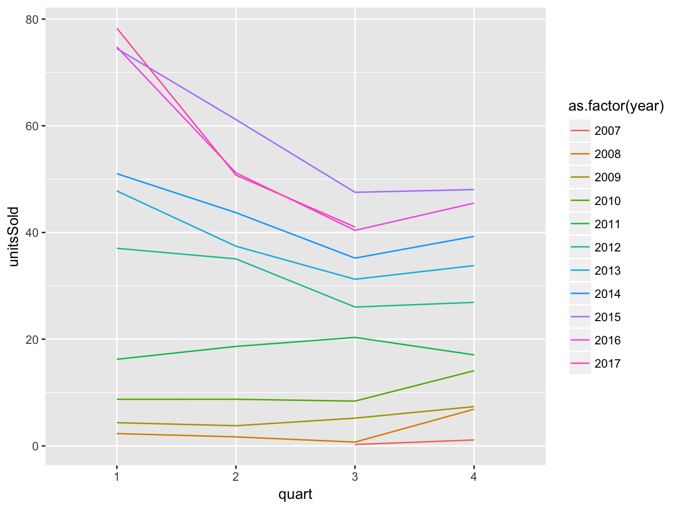 Note that within we pass year as a factor to prevent R from treating the variable as continous and thus using a color gradient instead of distinct colors. Also, we need to specify what values to group to draw each line, since color by itself is for accodomating different colors to the same line.
To stress why using appropriate data type is relevant, take a look a this example too, where the variable age is passed as a character.
selfiesCasualties %>%
  ggplot(aes(x = age, fill = gender)) +
  geom_bar() +
  coord_flip()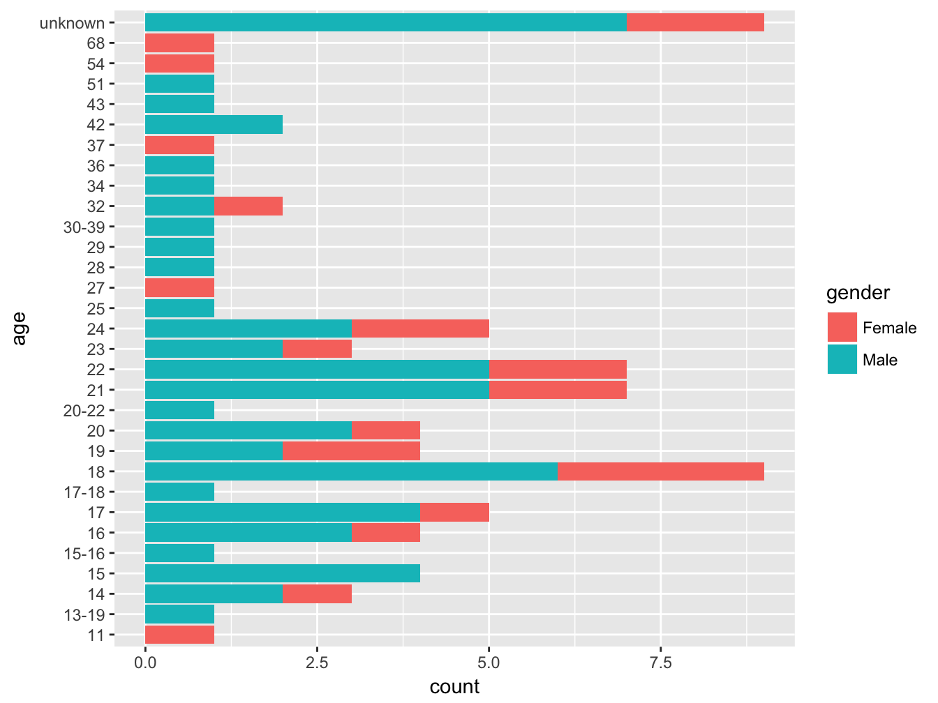
Figure 4.4: Age of victims by class
Visualizing a distribution ordering by a character variable as in Figure 4.4 could be misleading. Accidentally, age is plotted as a properly ordered categorical variable, bu there are two relevant side effets. First, the spacing between the bars constant, which in a way masks the the fact that the distribution peaks around ~20 years. Also, individuals of age unknown are plotted as if unknown was the highest possible value on the scale. Conversely, we would rather drop those values from the chart, since missing data do not really help understanding the age distribution. To take care of these aspects however, we need to understand a bit more about how to manipulate datasets, which is the topic of the [next chapter][dataAnalysis].