C Tidying data
All the exercises in this set require to normalize the dataset using gather() before you proceed to plot data. For readability, we recommend creating a new object with the normalized version of the dataset to be passed to ggplot()
- Use the dataset
usersByAgeto plot a barchart of total users by company, mapping different age levels to fill.
load('dataset/usersByAge.RDA')
tidyUsersByAge <- gather(data = usersByAge, key = 'age', value = 'users', -Company)
ggplot(data = tidyUsersByAge) +
  geom_bar(aes(x = Company, fill = age, y = users), stat = 'identity')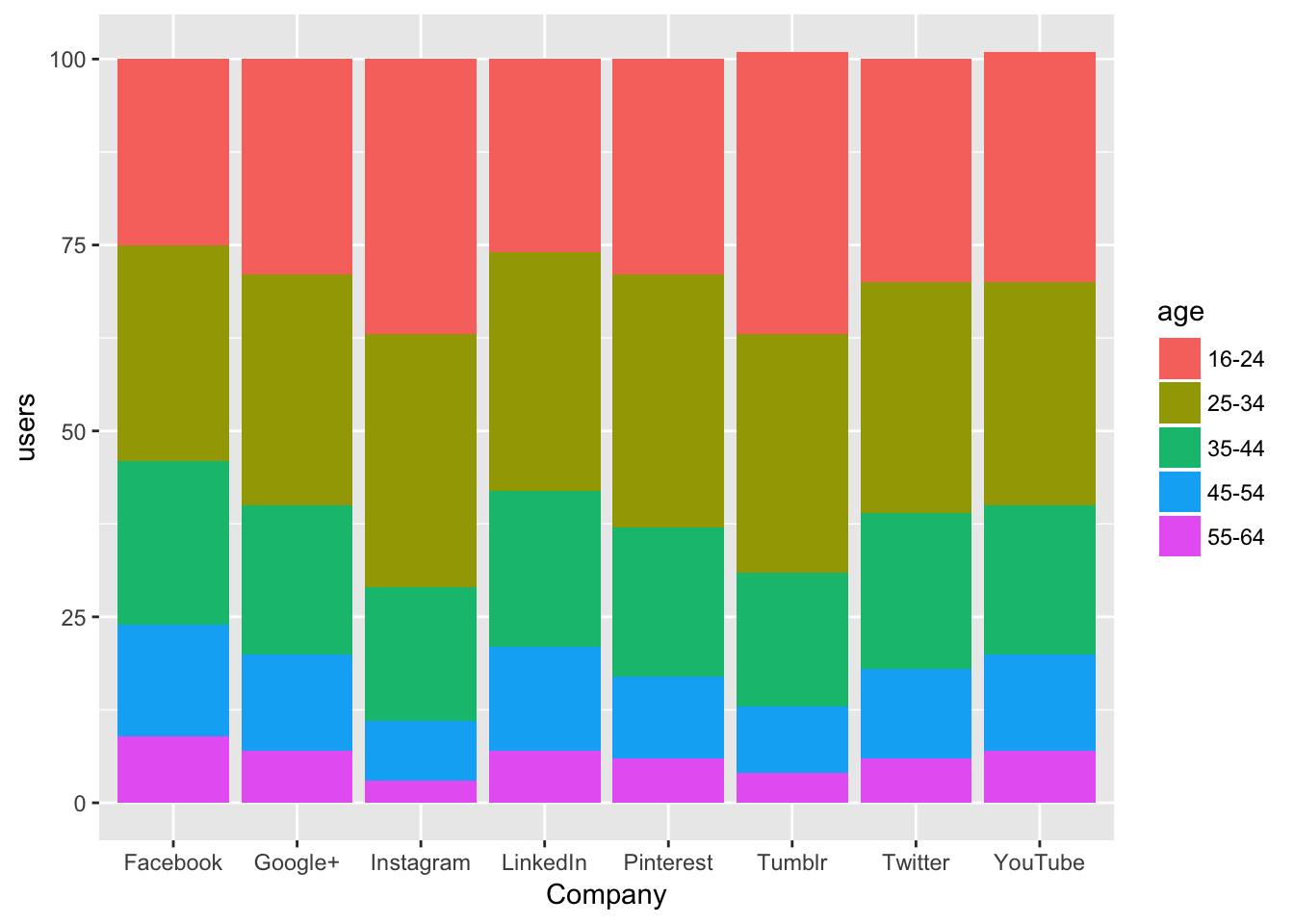
- Use
phoneByScreenSizeto plot a linechart of millions of phones sold each year by screen size
load('dataset/phonesByScreenSize.RDA')
tidyPhonesByScreenSize <- gather(phonesByScreenSize, 'inches', 'millions', -Year)
ggplot(tidyPhonesByScreenSize) +
  geom_line(aes(x = Year, y = millions,  group = inches, color = inches))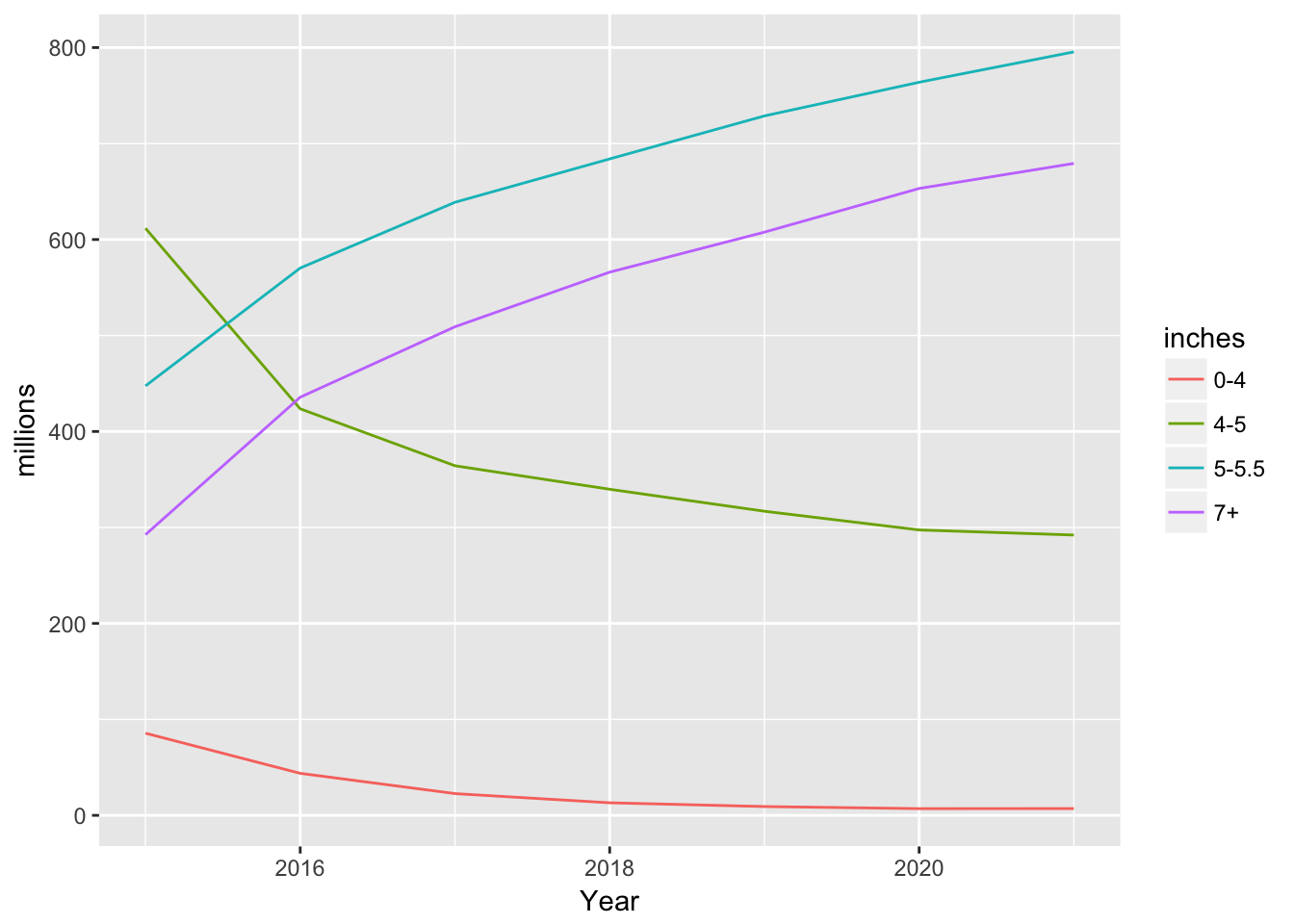
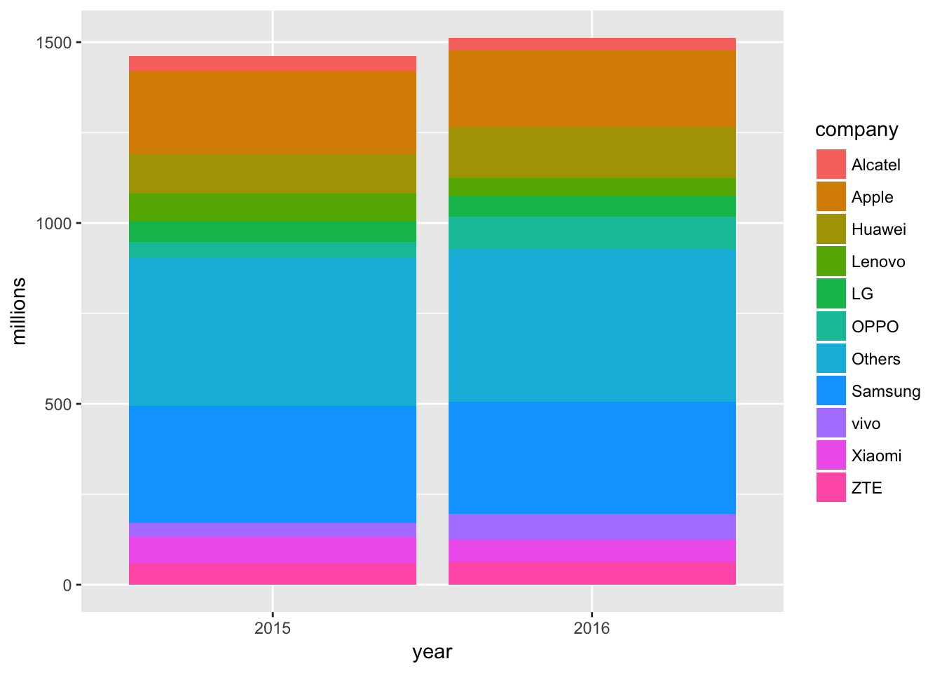
- Use
phoneShipmentsto plot a barchart of millions of phones shipped by year. Use fill to map companies to bars fill.
load('dataset/phoneShipments.RDA')
tidyPhoneShipments <- gather(phoneShipments, 'company', 'millions', -year)
ggplot(data = tidyPhoneShipments) +
  geom_bar(aes(x = year, y = millions, fill = company), stat = 'identity')